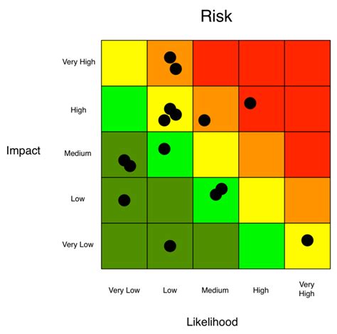
Creating a risk heat map in Excel is an essential skill for any professional involved in risk management, project management, or decision-making. A risk heat map is a visual representation of the potential risks and their likelihood and impact on a project or organization. It helps to identify, assess, and prioritize risks, making it easier to allocate resources and develop mitigation strategies. In this article, we will explore five ways to create a risk heat map in Excel, including using formulas, conditional formatting, and add-ins.
Why Use a Risk Heat Map?
A risk heat map is a valuable tool for risk management because it:
- Helps to identify potential risks and their likelihood and impact
- Enables prioritization of risks based on their severity
- Facilitates communication and collaboration among stakeholders
- Supports decision-making and resource allocation
- Enhances risk monitoring and review
Method 1: Using Formulas
One way to create a risk heat map in Excel is by using formulas to calculate the risk score and then using conditional formatting to display the results.

To create a risk heat map using formulas, follow these steps:
- Set up a table with the following columns: Risk, Likelihood, Impact, and Risk Score.
- Enter the risk data into the table, including the risk description, likelihood (e.g., High, Medium, Low), and impact (e.g., High, Medium, Low).
- Calculate the risk score using a formula, such as:
Risk Score = (Likelihood x Impact) / 100. - Use conditional formatting to display the risk score as a heat map, with higher scores indicating higher risk.
Method 2: Using Conditional Formatting
Another way to create a risk heat map in Excel is by using conditional formatting to display the risk data directly.

To create a risk heat map using conditional formatting, follow these steps:
- Set up a table with the following columns: Risk, Likelihood, and Impact.
- Enter the risk data into the table, including the risk description, likelihood (e.g., High, Medium, Low), and impact (e.g., High, Medium, Low).
- Select the cells containing the risk data.
- Go to the Home tab and select Conditional Formatting.
- Choose the "Color Scales" option and select a color scheme.
- Set the minimum and maximum values for the color scale.
Method 3: Using a Template
Using a pre-designed template is a quick and easy way to create a risk heat map in Excel.

To create a risk heat map using a template, follow these steps:
- Search for "risk heat map template" in Excel or online.
- Download and open the template.
- Enter the risk data into the template, including the risk description, likelihood, and impact.
- Customize the template as needed.
Method 4: Using an Add-in
There are several add-ins available for Excel that can help you create a risk heat map, such as Power BI or Tableau.

To create a risk heat map using an add-in, follow these steps:
- Install the add-in in Excel.
- Set up a table with the risk data, including the risk description, likelihood, and impact.
- Use the add-in to create a heat map, following the add-in's instructions.
Method 5: Using a Third-Party Tool
There are several third-party tools available that can help you create a risk heat map, such as risk management software or online risk assessment tools.

To create a risk heat map using a third-party tool, follow these steps:
- Research and select a third-party tool.
- Set up an account and enter the risk data into the tool.
- Use the tool to create a heat map, following the tool's instructions.
Gallery of Risk Heat Maps
Here are some examples of risk heat maps created using different methods:


FAQs
Q: What is a risk heat map? A: A risk heat map is a visual representation of the potential risks and their likelihood and impact on a project or organization.
Q: Why use a risk heat map? A: A risk heat map helps to identify, assess, and prioritize risks, making it easier to allocate resources and develop mitigation strategies.
Q: How do I create a risk heat map in Excel? A: There are five ways to create a risk heat map in Excel: using formulas, conditional formatting, a template, an add-in, or a third-party tool.
Q: What are the benefits of using a risk heat map? A: The benefits of using a risk heat map include improved risk management, better decision-making, and enhanced communication and collaboration among stakeholders.
We hope this article has provided you with a comprehensive guide on how to create a risk heat map in Excel. Whether you use formulas, conditional formatting, a template, an add-in, or a third-party tool, a risk heat map is a valuable tool for any professional involved in risk management or decision-making.
