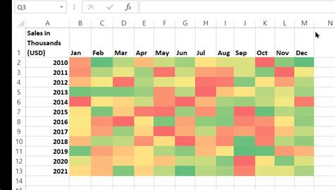
Creating a risk heat map is a crucial process in risk management that helps organizations identify, assess, and prioritize potential risks. A risk heat map is a visual representation of the likelihood and impact of different risks, allowing stakeholders to quickly understand the level of risk associated with each potential threat. In this article, we will walk you through the process of creating a risk heat map in 5 easy Excel steps.
The Importance of Risk Heat Maps
Risk heat maps are essential tools in risk management as they provide a clear and concise visual representation of potential risks. By using a risk heat map, organizations can:
- Identify and prioritize risks based on their likelihood and impact
- Develop strategies to mitigate or manage high-risk threats
- Communicate risk information effectively to stakeholders
- Monitor and review risk levels over time
Step 1: Define Your Risk Criteria

Before creating your risk heat map, you need to define your risk criteria. This involves identifying the risks that you want to assess and evaluating them based on their likelihood and impact. Consider the following factors when defining your risk criteria:
- Risk type (e.g., financial, operational, reputational)
- Risk likelihood (e.g., low, medium, high)
- Risk impact (e.g., low, medium, high)
Step 2: Create a Risk Assessment Table

Create a table in Excel to assess each risk based on its likelihood and impact. The table should have the following columns:
- Risk ID
- Risk Description
- Likelihood (Low, Medium, High)
- Impact (Low, Medium, High)
- Risk Score (calculated based on likelihood and impact)
Step 3: Calculate Risk Scores

Calculate a risk score for each risk by multiplying the likelihood and impact scores. You can use a simple formula to calculate the risk score:
Risk Score = (Likelihood x Impact) / 10
Where likelihood and impact are scored on a scale of 1-10.
Step 4: Create a Risk Heat Map

Use a scatter plot or a heat map template in Excel to create your risk heat map. Plot each risk on the heat map based on its likelihood and impact scores. You can use different colors to represent different risk levels.
Step 5: Interpret and Review Your Risk Heat Map

Interpret your risk heat map by identifying the risks that fall into each quadrant. The quadrants represent different risk levels:
- Low risk (green): risks with low likelihood and impact
- Moderate risk (yellow): risks with moderate likelihood and impact
- High risk (red): risks with high likelihood and impact
- Critical risk (black): risks with high likelihood and high impact
Review your risk heat map regularly to monitor changes in risk levels and adjust your risk management strategies accordingly.
Gallery of Risk Heat Map Examples


FAQs
What is a risk heat map?
+A risk heat map is a visual representation of the likelihood and impact of different risks, allowing stakeholders to quickly understand the level of risk associated with each potential threat.
How do I create a risk heat map in Excel?
+Follow the 5 easy steps outlined in this article to create a risk heat map in Excel.
What are the benefits of using a risk heat map?
+Risk heat maps provide a clear and concise visual representation of potential risks, allowing organizations to identify and prioritize risks, develop strategies to mitigate or manage high-risk threats, and communicate risk information effectively to stakeholders.
We hope this article has provided you with a comprehensive guide on how to create a risk heat map in 5 easy Excel steps. By following these steps and using the tips and examples provided, you can create a risk heat map that helps you identify and manage potential risks effectively.
